🎯 The Challenge
Many people want to invest, but feel overwhelmed by financial terms, market volatility, and decision-making. Traditional apps are too data-heavy or intimidating for beginners.
Problems identified:
Users didn’t understand what actions to take or why
Overload of charts with no context
No guided flows or education baked in
🚀 Goals
Design a mobile experience that:
Makes investing feel accessible and guided
Provides clear, AI-generated portfolio suggestions
Offers actionable insights, not just data
Feels premium, modern, and user-friendly
🧭 My Design Process
1. 🧠 Research & Planning
Kick-off with founder to understand business goals
Studied Robinhood, Finary, Wealthfront, and Plum
Defined two personas:
• Aspiring Investor – wants to grow savings
• Confident Investor – wants optimization and clarityIdentified 3 key user jobs: Understand → Act → Monitor
2. ✍️ UX & Flow Mapping
Simplified IA: Dashboard → Portfolio → AI Suggestions → Insights
Mapped onboarding around AI personalization (“What are your goals?”)
Added an “AI Assistant” UX pattern to suggest rebalances & explain risks
3. 🎨 UI & Visual Language
Clean, minimal design with soft cards, intuitive charts
Created modular components to reuse across insights, asset types, and modals
Used a modern dark mode UI with rich purples and teals for a trustworthy, intelligent feel
Mobile-first touch zones, gestures, and scroll behaviors optimized
🧩 Key Features I Designed
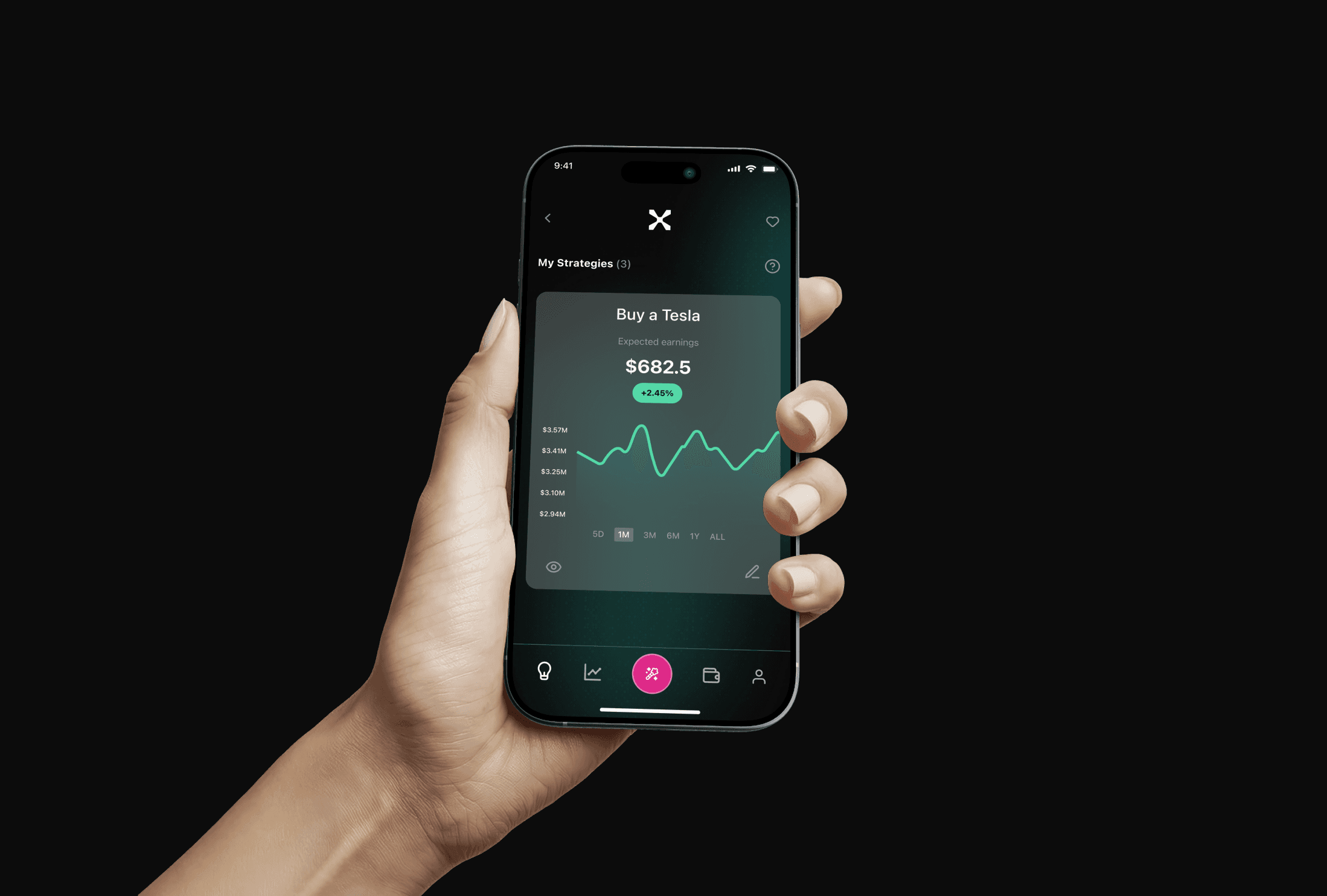
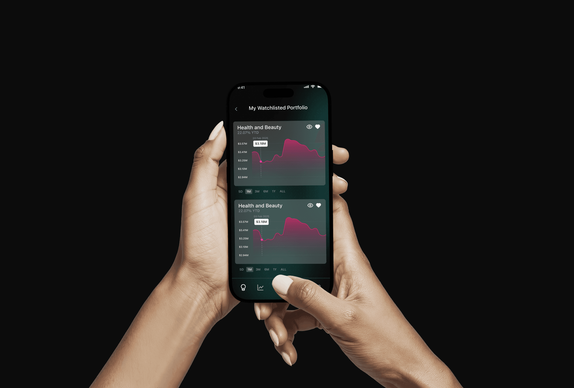
📊 Portfolio Overview
Card-based layout of asset types (Stocks, Crypto, ETFs)
Simple value + change display, animated transitions
Expand for detailed breakdowns or insights
🤖 AI Suggestions
Personalized tips: “Reduce exposure to X,” “Rebalance into Y”
Natural language tone (“Here’s what we think is next…”)
Accept/reject suggestions in 1 tap
💡 Insights Feed
Digestible, short-form insights from market + AI data
Weekly performance summaries, sentiment tags
Built trust by explaining why an action was recommended
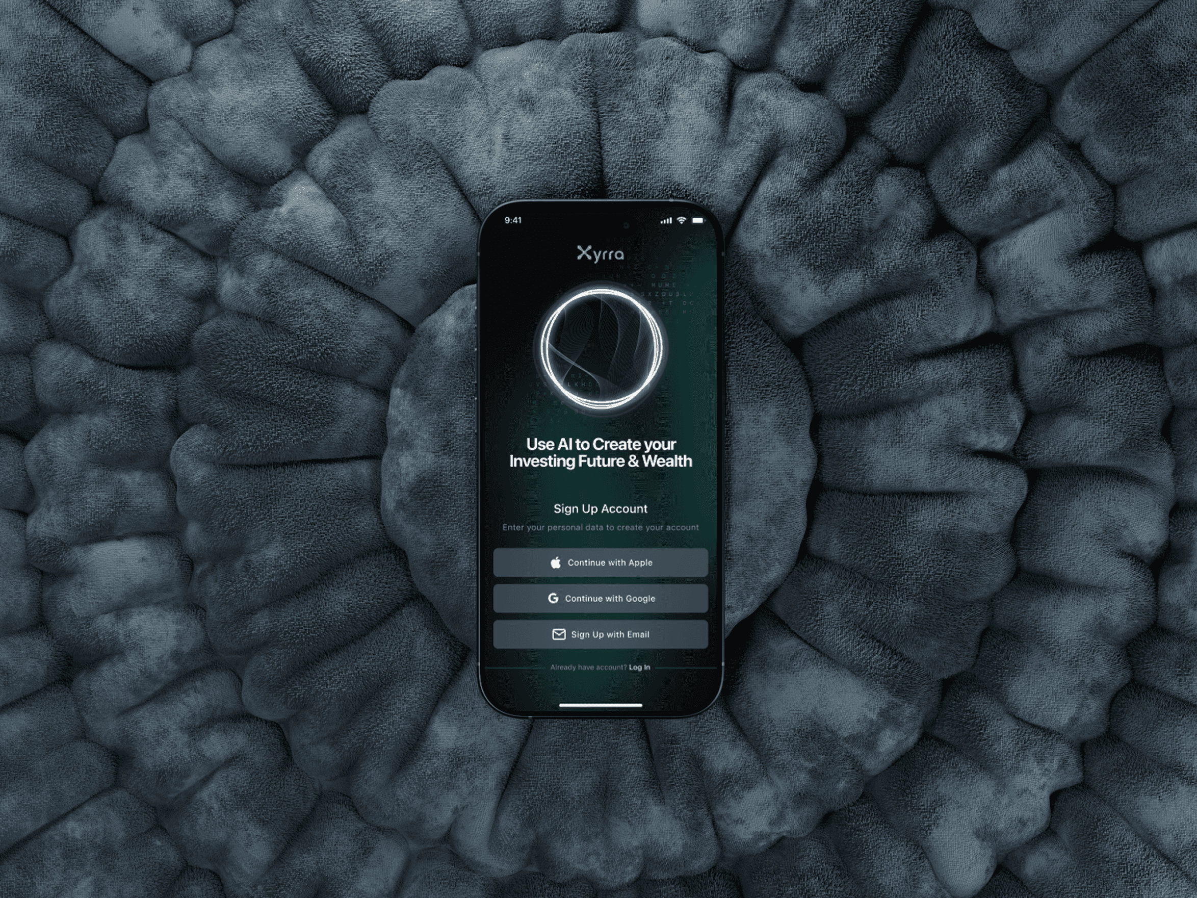
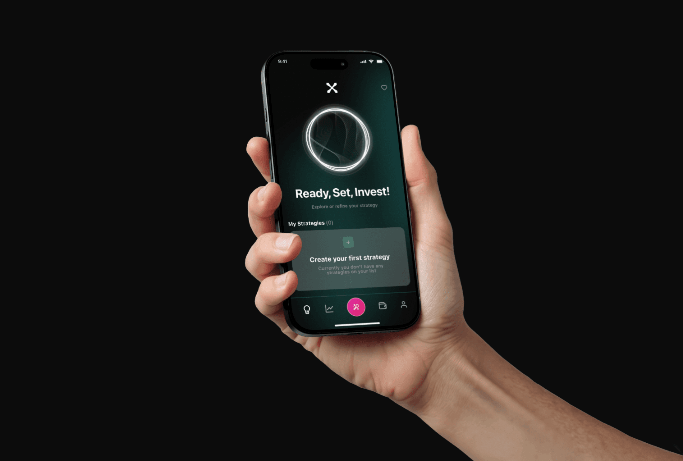
🚀 Onboarding & Goal Setting
Friendly walkthrough → define risk level → pick goals
Real-time AI preview shows what the app will help achieve
⚙️ Challenges & Solutions
Challenge:
Investment dashboards often confuse non-experts.
Solution:
Used a clean card-based structure with smart grouping (by goal or asset type), added definitions via tooltips, and built in a “Learn as you go” layer with a subtle icon glossary.
Challenge:
Users didn’t trust black-box AI suggestions.
Solution:
Added explainability tags and a “Why this?” toggle to AI suggestions, backed by charts and plain language reasoning (“Due to 15% drop in tech exposure last week…”).
✅ Outcome & Learnings
Delivered a complete mobile product design, from flows to final UI
Built a scalable mobile component library for future feature expansion
Successfully balanced AI automation with user control
Feedback from internal team: “It feels like something Apple would make.”
Key learnings:
Fintech doesn’t have to feel cold — clarity and friendliness boost trust
Microcopy and empty states matter more than charts
Mobile-first design forces better prioritization and flow thinking