🎯 2. Problem / Challenge
What problem did the product aim to solve? What was broken or missing?
Influencers often juggle multiple platforms (Instagram, TikTok, YouTube) and deals, with no centralized place to track performance, income, or deadlines.
Existing tools are scattered, overly complex, or too generic — not tailored to creator workflows.
🎨 3. Goals
What were the product and design goals?
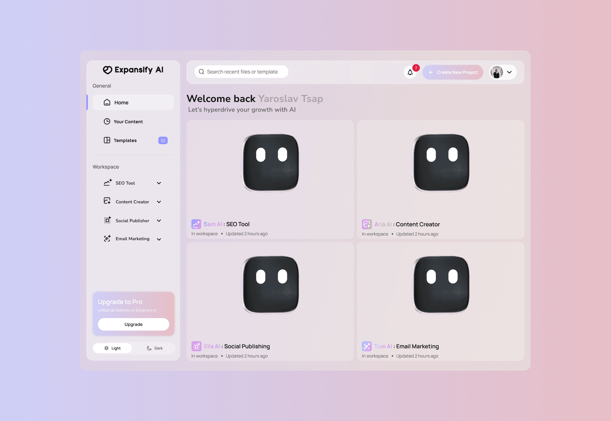
Centralize deal & content tracking in one app
Simplify performance analytics for non-technical users
Help influencers manage their posting schedule
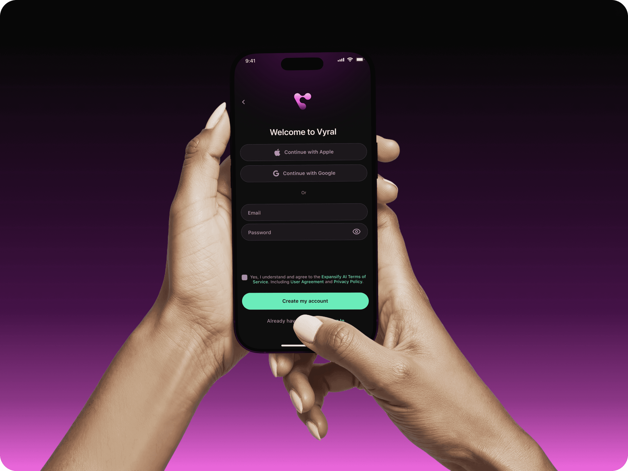
Make the app intuitive, modern, and minimal
Create a flexible UI that works across different content types
🧭 4. Process
How did you approach the problem?
Break into steps like:
🔍 Research
Interviewed 5 micro-influencers to learn about their daily workflows
Competitor audit: Later, HypeAuditor, Notion templates
Found that most creators use Google Sheets, screenshots, and notes to manage work
✏️ UX & Wireframes
Mapped key flows: Campaign tracking, content calendar, insights dashboard
Created low-fidelity wireframes to test layout ideas
Feedback: users wanted more automation and less “spreadsheet-feeling”
🎨 UI Design
Built a light, clean visual style with pops of brand color
Focused on clarity, whitespace, and intuitive navigation
Designed a flexible component system for scalable screens
🧩 5. Key Features
Highlight 3–4 major features you designed.
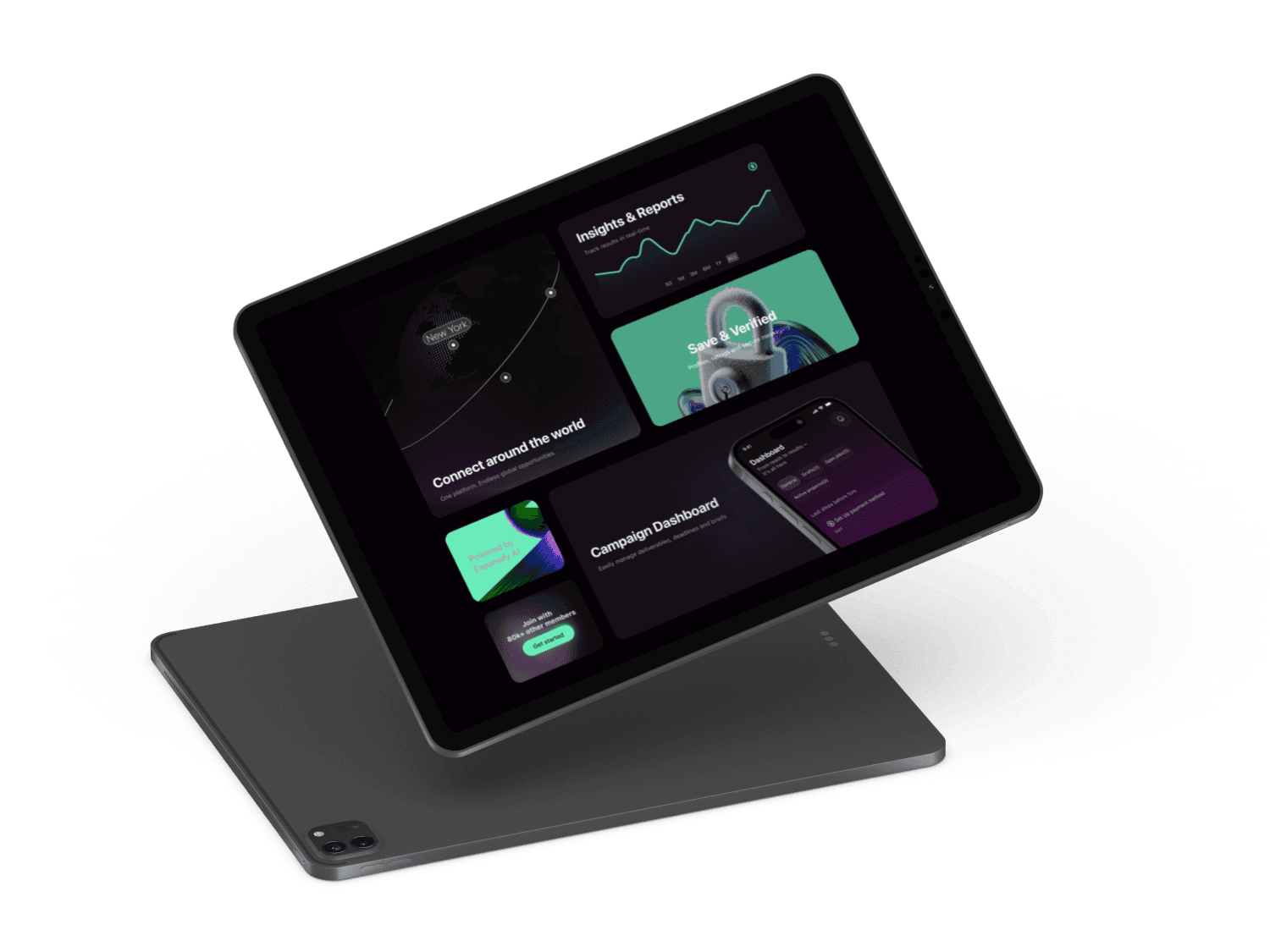
Campaign Tracker: See all active/past brand deals in one place
Content Calendar: Plan & schedule upcoming posts visually
Insights Dashboard: Quick stats from connected platforms (followers, views, engagement)
Task Reminders: Deadlines & deliverables per campaign
⚙️ 6. Challenges & Solutions
Mention 1–2 tricky problems and how you solved them.
Challenge:
Users had different content cycles — some post 3x a day, others once a week. A fixed calendar layout was too rigid.
Solution:
Designed a modular calendar where posts can be grouped by platform or project, with swipe views for flexibility.
Challenge:
Users felt overwhelmed with analytics.
Solution:
Used simple visual indicators (up/down arrows, color-coded bars), optional “deep dive” screens, and tooltips to keep the UI light but informative.
✅ 7. Results & Takeaways
What was the outcome? What did you learn?
The app prototype was tested with 5 creators and received strong feedback:
“Finally something made for how we actually work.”
4 out of 5 testers said they would switch from their current workflow
What I learned:
Simplicity wins. Clean UI with fewer options = faster adoption
Involving users early made the product more relevant
Reusable components saved a ton of time when scaling screens